Subscribe to:
Post Comments (Atom)
skip to main |
skip to sidebar

About Me

- anne
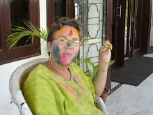
- i am a quilter, fabric dyer and world traveler. i collect way to many fabrics from the countries i visit!
My Website
NeoCounter
Blog Archive
-
▼
2008
(65)
-
▼
July
(8)
- Next! I just have so much fun!!! I cant wait to s...
- I was at the market the other day and I saw these...
- The start of something new I like this. I thought...
- This is the final out come, I am very happy with ...
- I have had a few people say that this piece would...
- Well this is finished to the point where it will...
- Here is a new piece I am working on! I started th...
- I cant help it.... the cute cat shot! He loves to...
-
▼
July
(8)


3 comments:
I like it "upside down".
I like it this way better.
I like it as you have it. Wonderful color, wonderful modulation!
Post a Comment